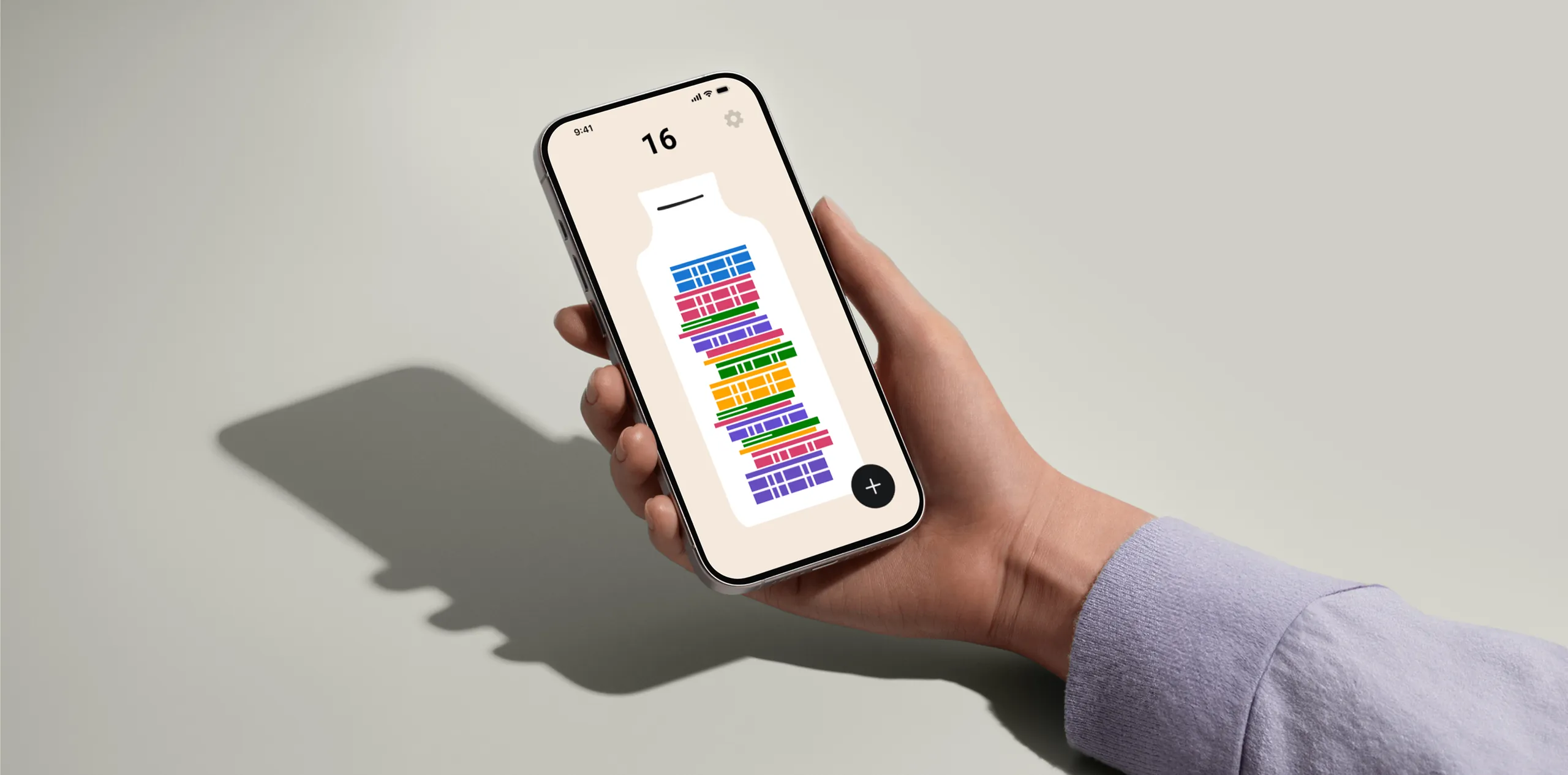
Reclaiming the Joy of “Done”
Diiing is a minimalist time tracker I independently designed and developed during the summer of 2025. It is now live on the App Store.
It was born from my personal struggles with mainstream productivity tools. For years, like many others, I found myself trapped in a vicious cycle: ambitious planning, inevitable failing, and eventual burnout. This has led to many unproductive hours and unhealthy use of my time.
With Diiing, I want to empower people to be more mindful of their own time by building a rewarding system of self-motivation.
Identifying critical drop-off moments
I analyzed user reviews from leading productivity apps on the App Store and online discussions, identifying two critical abandon moments where users experienced the greatest friction.
01 Pre-log stage
Timer-first design conflicts with spontaneous action.
02 Analytics stage
Feedback deficit kills long-term motivation.
Productivity Paradox: More features lead to less action
To validate whether these pain points were systemic, I deconstructed the core feature architecture of 8 productivity apps, discovering they all share 3 patterns that exclude spontaneous users.
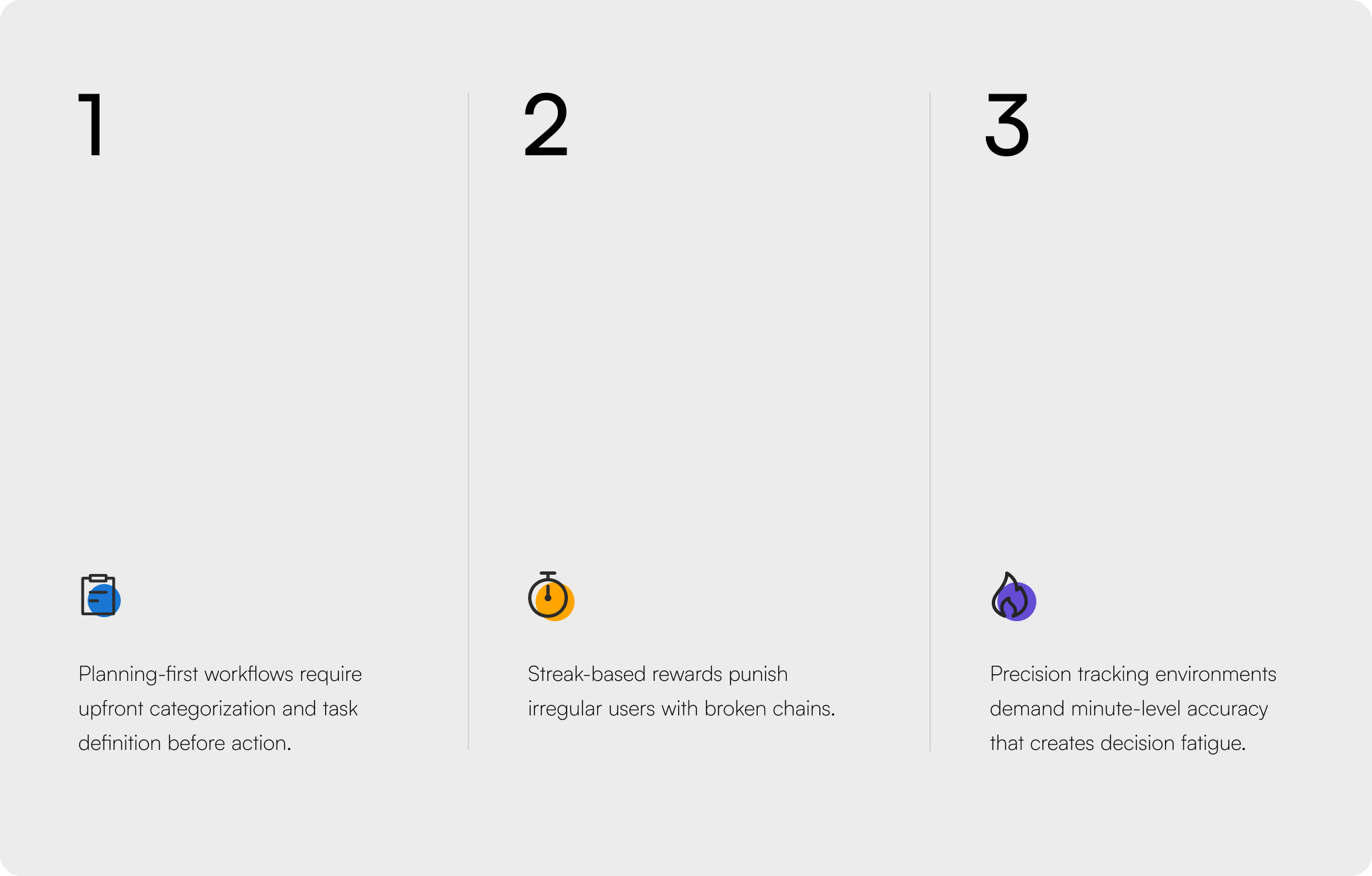
Mainstream apps operate on a"plan-first" paradigm, demanding significant upfront user effort. This approach often results in feature pile and cognitive overload, which creates a high entry barrier for a large group of non-planning users.
This core misalignment traps users in a cycle of high logging friction and delayed feedback loop. It's a systemic failure that leads to poor engagement and retention, ultimately leaving them feeling less productive and unmotivated.
With the dual drop-off problem identified, I broke down the design challenge into two core directions.
01 How do we reduce logging friction?
02 How do we sustain logging motivation?
Establishing the core loop of log and reward
I focused on building a minimal viable motivation loop and hypothesized that combining two elements could sustain engagement.
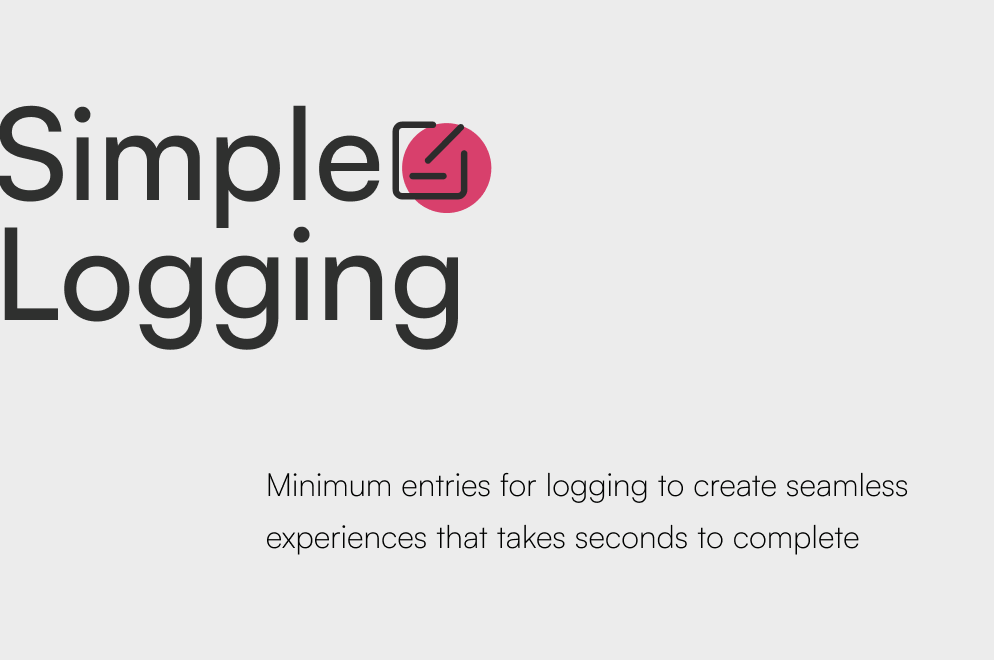
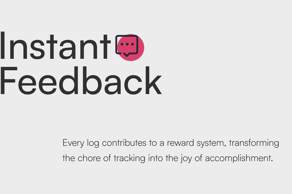
Building on the core loop, I designed three features that work together to create a sustainable motivation system.
Transform every effort into a visual reward
Every logged entry becomes a colorful “coin” that drops into your daily jar. The coin's color represents its category, its height reflects duration, and together they stack into a visual sculpture of your day.
I chose the coin jar metaphor because of its universal relatability and emotional resonance. The metaphor needed to carry both immediate gratification and cumulative meaning—filling a coin jar achieves both. The coin jar doesn't judge productivity; it acknowledges effort.
Record in seconds with little setup required
Logging an action requires only a few taps with predefined categories, estimated durations, and an optional note. No timers, no project hierarchies, just a seamless flow.
I faced a critical trade-off between flexibility and speed. Although custom categories and precise time inputs would offer more personalization, this decision sacrificed data precision to achieve the core goal: making logging faster than sending a text message.
See the story of your time
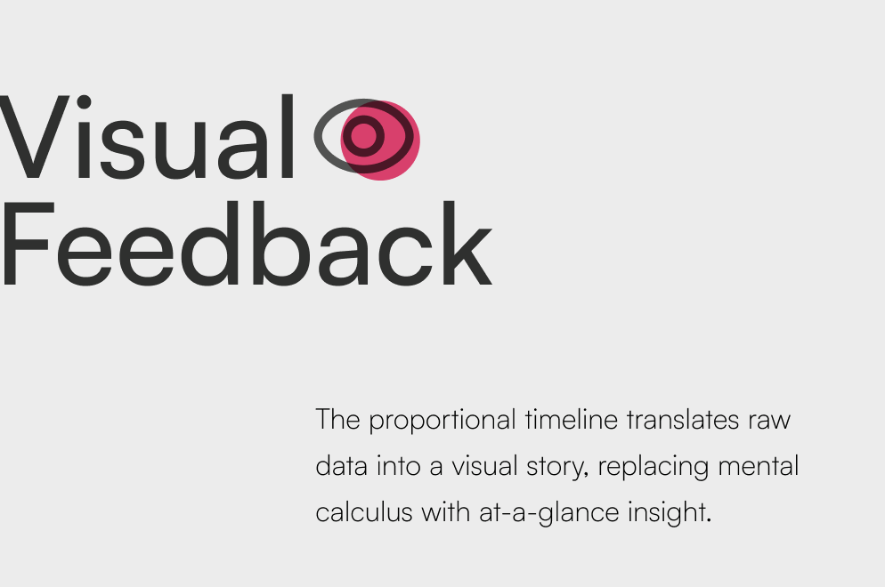
Each day appears as a vertical timeline where logged entries become proportional color blocks. Block height represents time spent, color indicates category. Days stack chronologically, creating a scrollable visual history that reveals patterns.
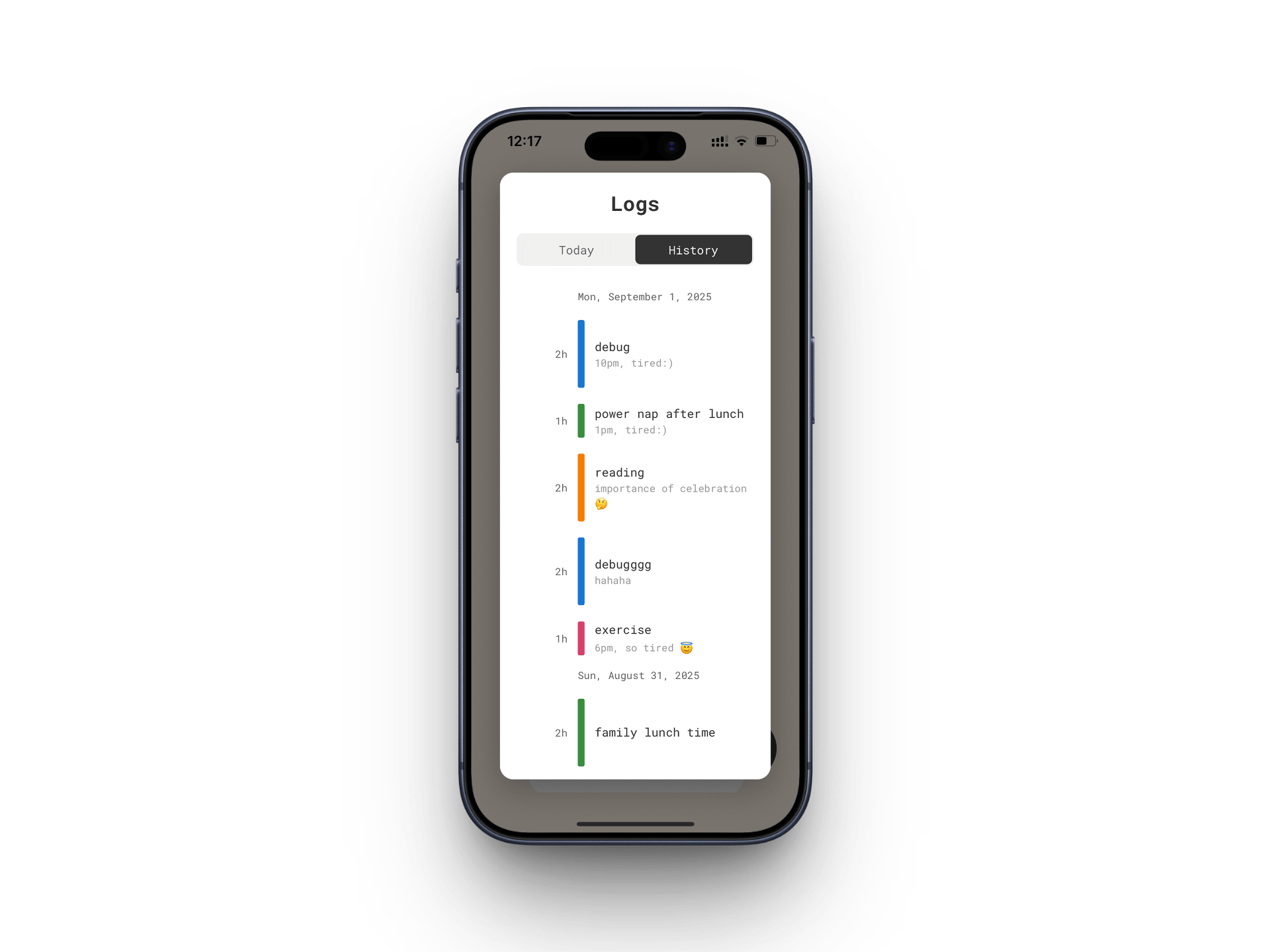
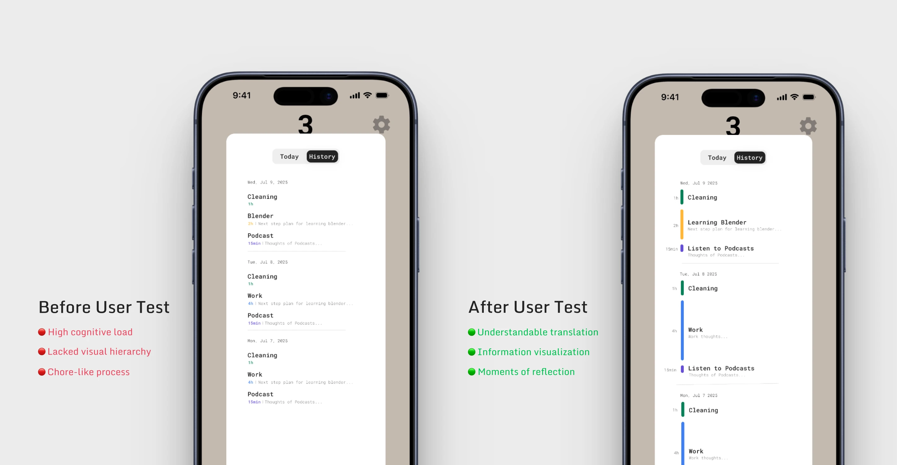
Users failed to get at-a-glance insight in the app’s early explorations
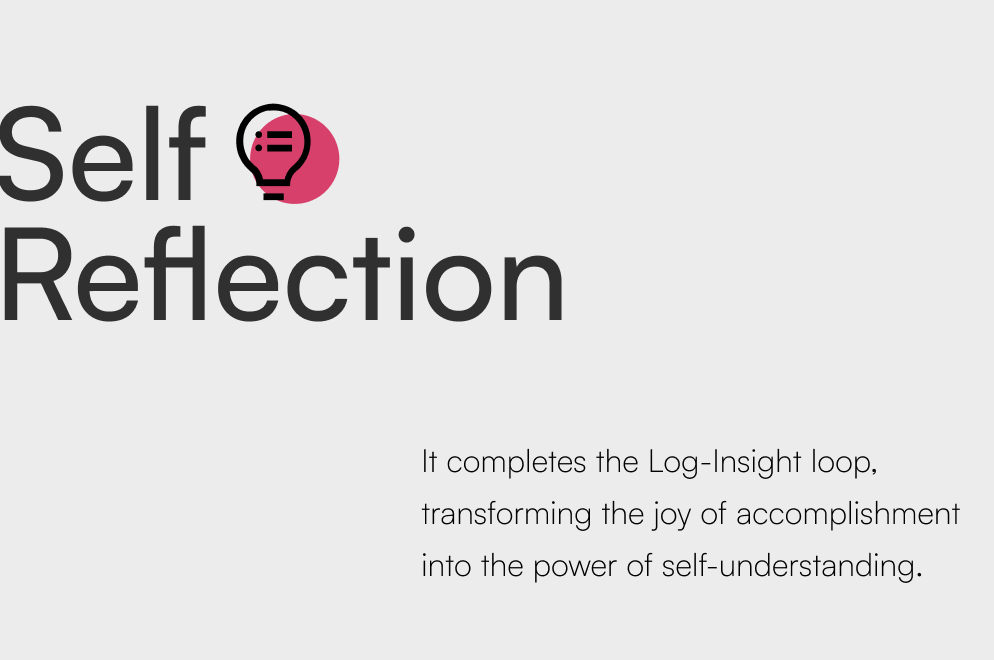
To understand their day through the initial list view, users had to manually read each entry, and mentally piece together the narrative of their time. The core value of effortless reflection was missing. I enhanced the user experience by introducing a proportional, color-coded timeline derived from the color concept of “coin”, which help users navigate the page more effectively.
I developed a marketing narrative that empathizes
The primary goal was to make it feel less like an advertisement and more like an intimate understanding of the user's inner world. I chose not to focus on features, but on a feeling: the quiet, often overlooked value of everyday efforts.
Leveraging emerging AI video technology, I translated this self-reward concept into an emotionally resonant story. The narrative centers on the “invisible labor” of a mother, whose immense daily contribution—often dismissed even by herself—is finally seen and validated.
I launched Diiing to the App Store and validated the core hypothesis
After 12 weeks from concept to launch, Diiing achieved strong early-stage engagement with 50+ organic users in the first two weeks with zero marketing, 70%+ adoption rate for the core review feature among DAUs, and a 5-day average usage streak among users.
“It's really emotionally pressure-free and interesting in action.”
“Love this ‘build from zero’ concept rather than just completing tasks.”
Working as a solo designer and developer elevated my ability to balance vision with pragmatism
Design constraints as strategic advantages.
Shipping a focused MVP without AI-powered insights was a deliberate choice. Narrowing scope gave clean data on whether the core hypothesis resonated with users.
Building for future iteration from day one.
I also documented scaffolding for the deferred features from day one, so the foundation could scale by validated need rather than upfront assumption, without refactoring.